PornFrost
https://pornfrost.com
Porn Frost! Oh, I just love reviewing these websites. Why? Cause I already know that they’re going to be shittier than mine since mine is the best one there is! But alright, I don’t mean to be a meanie. Let me dive into PornFrost.com and explain exactly why this website is a total wreck and can’t compare even a little bit to my masterpiece. We’re going to dissect this place as much as possible, which might not even be a lot since there’s not much that this website can show us to be completely honest with you.
Not that many porn sites are listed as expected
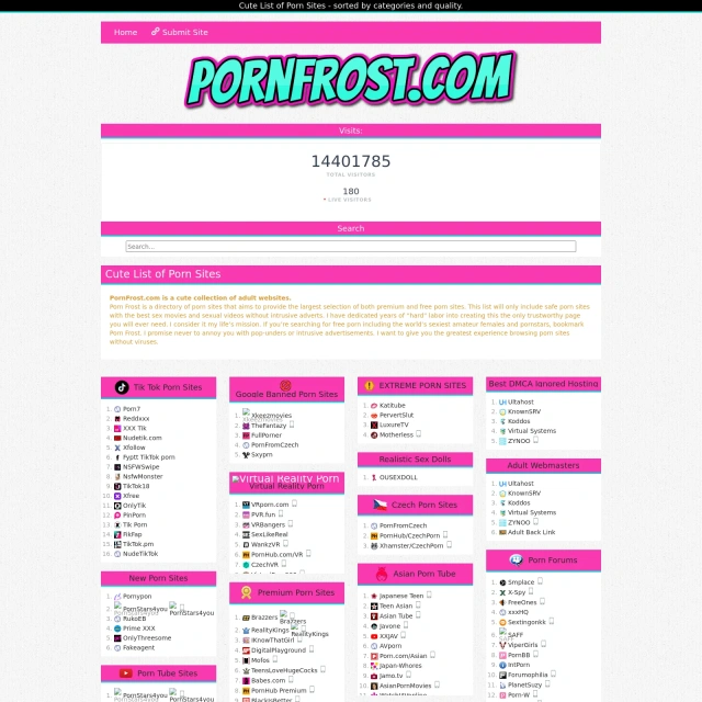
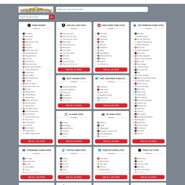
Alright, alright, that’s enough shit talking without backing it up with facts. But you guys know The Porn Dude always backs his words up with pure facts. And the fact of the matter is that Porn Frost is simply lacking a lot of what makes porn index sites important. The first thing they lack is a good number of sites that they reviewed on PornFrost.com. Seriously, just make a rough count of all the sites that they’ve got listed on their website and then look at my list. Yeah, mine is pretty unbeatable.On that alone we could say that I’m the winner here, but if you for some reason want to visit this website instead, well, at least they do offer some websites in their lists. I can’t take that away from them, so if you’re looking for porn lists and for some reason don’t want to use my much superior website, then I guess you can try this place out. But let’s be honest for a second here, we both know that you ain’t going to do that. I know I wouldn’t and I’m the best authority there is when it comes to porn!
The design doesn’t look good at all
But it’s not just the number of links that they offer which is lacking compared to me. Nope, their design is really bad too. Just looking at it you can notice that this place is basically a much lower quality website. PornFrost.com made all the elements on their website disproportionate and they obviously don’t need to be so zoomed in. But they don’t know that, how could they, they’re just bad at design and you can notice that from a mile away. And no, it’s not just because it’s so fucking zoomed in.It’s just bad, for lack of a better word. If they really wanted to go for that modern feel which they tried so hard to rip off of my site, then they should’ve done many things differently. Now, obviously, I’m not going to say what those things are because I don’t want them ripping me off even more than they already are. And they obviously are, it’s just that they can’t seem to do a good job with that either. I mean you all know that kid who always cheated on tests but couldn’t even copy the answers right? Yeah, that’s the kid right here with PornFrost.com.
All the icons are fucked up and cut off at the bottom
What else don’t I like about PornFrost.com? I don’t like the fact that they fucked up all of their icons. Not only are they a really low resolution, so you can’t even tell what the icon is supposed to represent sometimes (the Hentai icon… what the fuck is that supposed to be), but they’re also cut off at the bottom many times. If you look at the icons, you’ll notice that they fucked up the code so they sliced off the bottom part of the icons. A black girl icon lost her chin, the money bag icon has a huge hole at the bottom. Basically, a lot of shit is wrong here, I don’t even want to start listing all of them.I think there’s something fishy around here
And what about that coupons icon? Wait a second… I recognize that icon. This shit is straight from that other porn list site "MrPornGeek". They managed to fuck that up too, so you can see the background since it’s not the correct color. But more importantly, I think we’re onto something here. Let’s keep snooping around for more clues. We definitely know that that coupon is from Mr. Porn Geek, so either PornFrost.com is copying him or there’s a bigger conspiracy in the works.Oh and would you look at that, I think I’ve found a good enough clue to confirm my theory. The theory is that both PornFrost.com and Mr Porn Geek are run by the same beta cuck that can’t make a proper site. And how do I know this other than that icon? Well, PornFrost.com look like garbage in its totality, and ’s site looks like garbage in its totality. Boom, theory confirmed. Wrap this one up boys, it seems like we’re going to go home early today.
The logo looks nice with the cyan and magenta color choice
Now, okay, there have to be some things that I like about this website… right? Well, if there’s one thing I like, it’s the logo. I think that the color choice with the magenta and cyan is SICK, and I really dig it. Not for my site of course, but for this one at least, I think that the color palette is nice. And since the logo is of that palette I think it looks good. Maybe it’s just a bit too big so that’s a potential issue I have with it. That and the fact that there’s another logo right next to it which makes no fucking sense.At least they have a dark background
Why do you have two logos? Oh whatever, I’ll drop it. Here’s another thing I like about this site and everyone could predict this one. It’s the dark background. Now, obviously, when you go to my site you’ve got the option to choose which is superior in every way, but at least this place isn’t just white. That would be horrible. So yeah, kudos for making the website dark so that we don’t burn our eyeballs when we’re browsing through it late at night.Black text on a dark background… really?
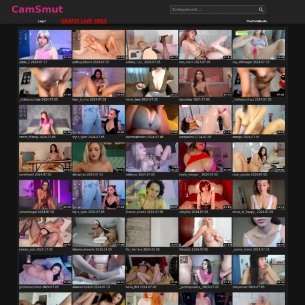
Here’s another shitty design bug. If you scroll down enough, you’ll see all the newest additions to the site and you’ll see that the thumbnails have a black text under them saying what site they are. But that’s a problem when your background is dark as well and you don’t have a background color for your scrolling element you dipshits. PornFrost.com really needs to get their act together with some of these rookie mistakes or else they might as well shut this place down.Short reviews with only the pros and cons listed, no in-depth review
When you go to any review you’ll notice that the only thing they have is the pros and cons of a website. No review, no actual body of text. Honestly, they probably hired some Indians to write the pros and cons section, cause anyone with two brain cells can write that bull crap. When you go to my reviews, you’ll see some of the most coherent reviews out there. And you know that they’re coming from a credible source that is The Porn Dude. And let me tell you this, you can’t go wrong with an experienced guy like me.But before I jack myself off even further on this review by complimenting myself more and more, I think I should end it. PornFrost.com is a website that you can visit if you’re looking for short pros and cons for the website and you’re a fan of smaller lists than what I have to offer. Why you’d be a fan of all of this I have no idea, but if you’re on crack or something, then definitely give PornFrost.com a go. In the meantime, though, keep enjoying The Porn Dude, for the best porn websites on the internet.
- I guess they’ve got lists of porn sites
- The logo looks kinda nice
- Horrible designs with cut off icons next to the porn list name
- Not as many porn sites listed and reviewed as yours truly
- Some of the worst design choices including black text on a dark background
